HALSTEAD WEBSITE
Research, Design, & Prototyping | 2022-2023
HALSTEAD WEBSITE REDESIGN
Last year Halstead decided they needed to modernize their website. I was put in charge of creating the wireframes and mockups that would be given to the developers. Halstead requested the website to have a more modern feel, easier usability for customers, and better navigation than the current website.
CONTRIBUTIONS
Research & Prototyping
UI/UX Design
Responsive Design
Icon Design
Photography & Videography
PROGRAMS UTILIZED
Illustrator
Photoshop
Figma
COLLABORATORS
Janelle Hinesley – Sr. Graphic Designer
Kelli Greene – Manager
Ashley Maldonado – Digital & Email Marketing Specialist
Sylvie Alusitz – Studio Coordinator
Znode – Web Developer
ABOUT
HALSTEAD
Halstead is an eCommerce jewelry supply firm that caters to both large and small studios in every facet of the jewelry industry (pun intended). Halstead believes in the power of small businesses to support hard-working families who want to live life on their own terms. Small business drives our economy and the American dream for many entrepreneurs. We know how tough it is and we respect the tenacity it takes to build a jewelry studio. We endeavor to be an advocate and indispensable supply chain partner for small jewelry businesses around the world.
MY ROLE
I was tasked with researching, designing, and prototyping several pages of the new website, along with creating custom jewelry icons and taking or sourcing new photos for the new pages that Halstead was wanting created.

RESEARCH & PROTOTYPING
With the changing landscape of online retail over the last few years, Halstead Bead, the company for which I work, has transitioned from a wholesale jewelry supplier to offering both wholesale and retail.
This meant that the website needed:
- A sleeker, more modern design that would help draw in younger customers without alienating the older ones
- Improved navigability & product filtering that would allow current and new customers to find items faster and with less stress
- New landing pages that would be aimed at the 4 main types of customers Halstead served
- Various ways of showing customers new products that they otherwise wouldn’t have seen
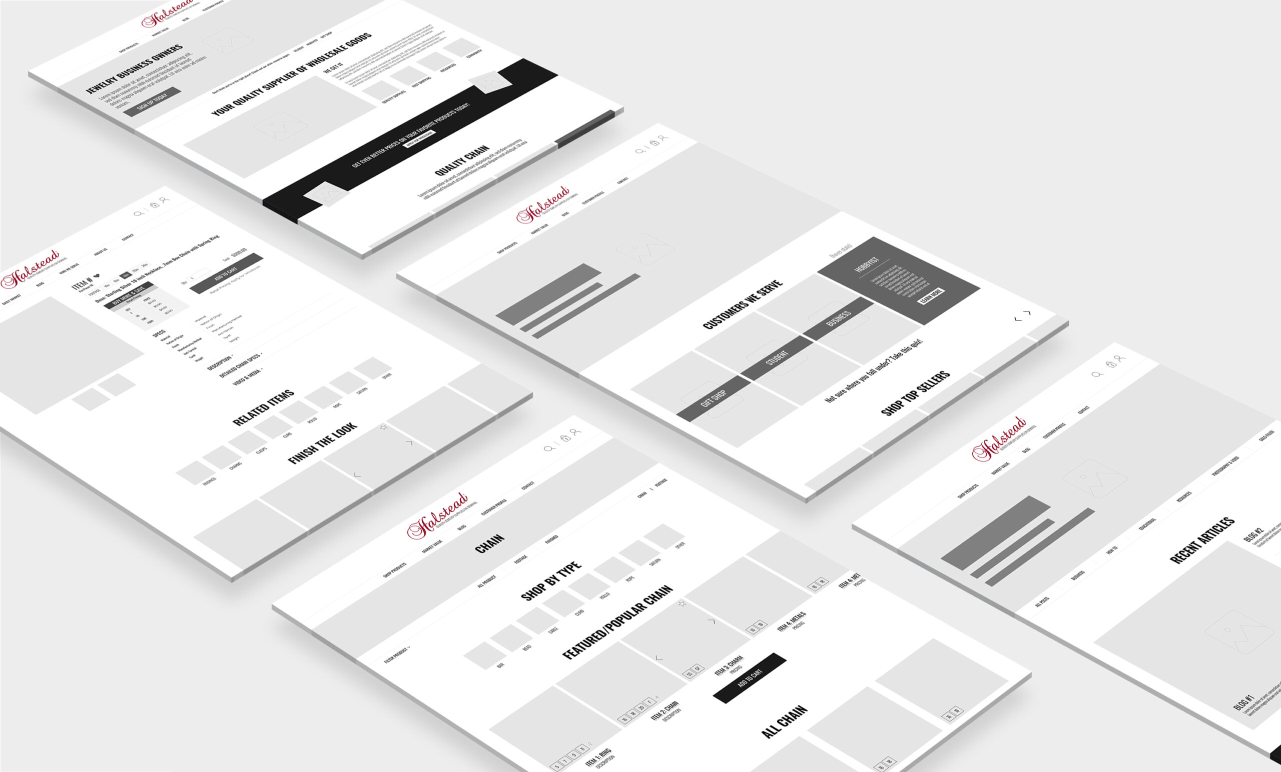
UX PROTOTYPING
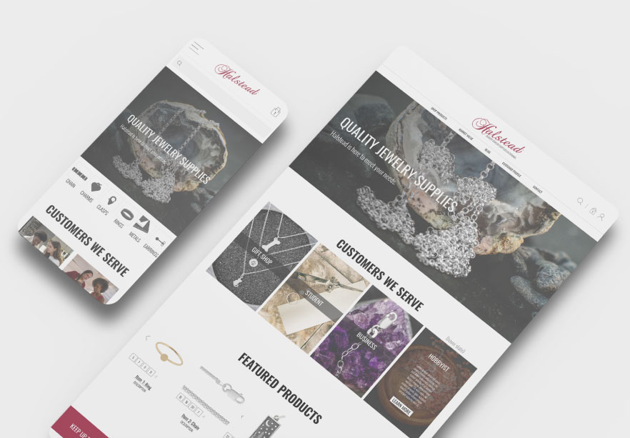
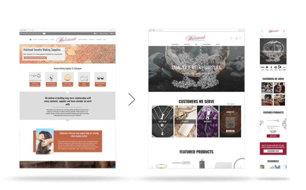
After the main issues of the current site were highlighted and the wants for the new design were clear, I began creating a black-and-white prototype of the new website.
UX prototypes included the homepage, customer persona landing page, the blog homepage, a product category page, and a product details page.

MENU DESIGN
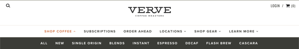
Halstead needed a multi-menu design that would be easy for our customers to navigate and would work with the multiple subcategories we have of our products. My boss did not like the mega menu designs, so anything like menu of Topo Designs was out.
After looking at several websites, I settled on a design similar to Verve. We liked that the submenu stayed a single line, but we wanted the submenu to show under the masthead image so customers wouldn’t have to scroll too far up to reach it.
Desktop Menu

Original Halstead menu design
Menu design inspiration

New menu mockup
Mobile Menu
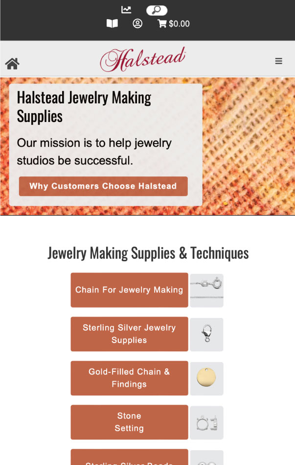
Original Design

Inspiration - Tiffany
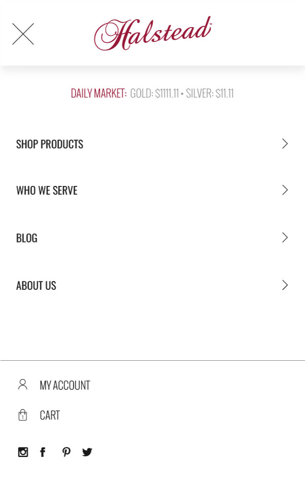
New mobile menu mockup
UI DESIGN
The development of the website was going to be contracted out, so my next step after creating the UX prototypes was to create a UI guideline for them to follow.
In addition, I began sourcing images and creating icons to fill out the wireframes. Halstead had a few alterations, but were overall pleased with the new, modernized style.
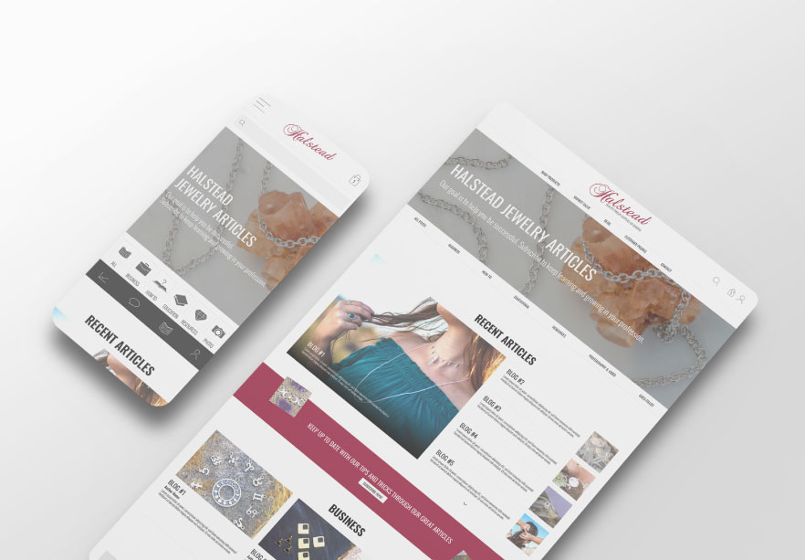
HOMEPAGE
I cleaned up and modernized the new home page so that it now features a larger masthead and a reduced amount of copy. The product categories seen below the former website masthead didn’t lead to product pages, but info pages. The new design now features actual products and product categories higher up in the page.
Halstead wanted to create and feature info pages for the four main categories of customers we serve, so that became the main feature below the masthead.
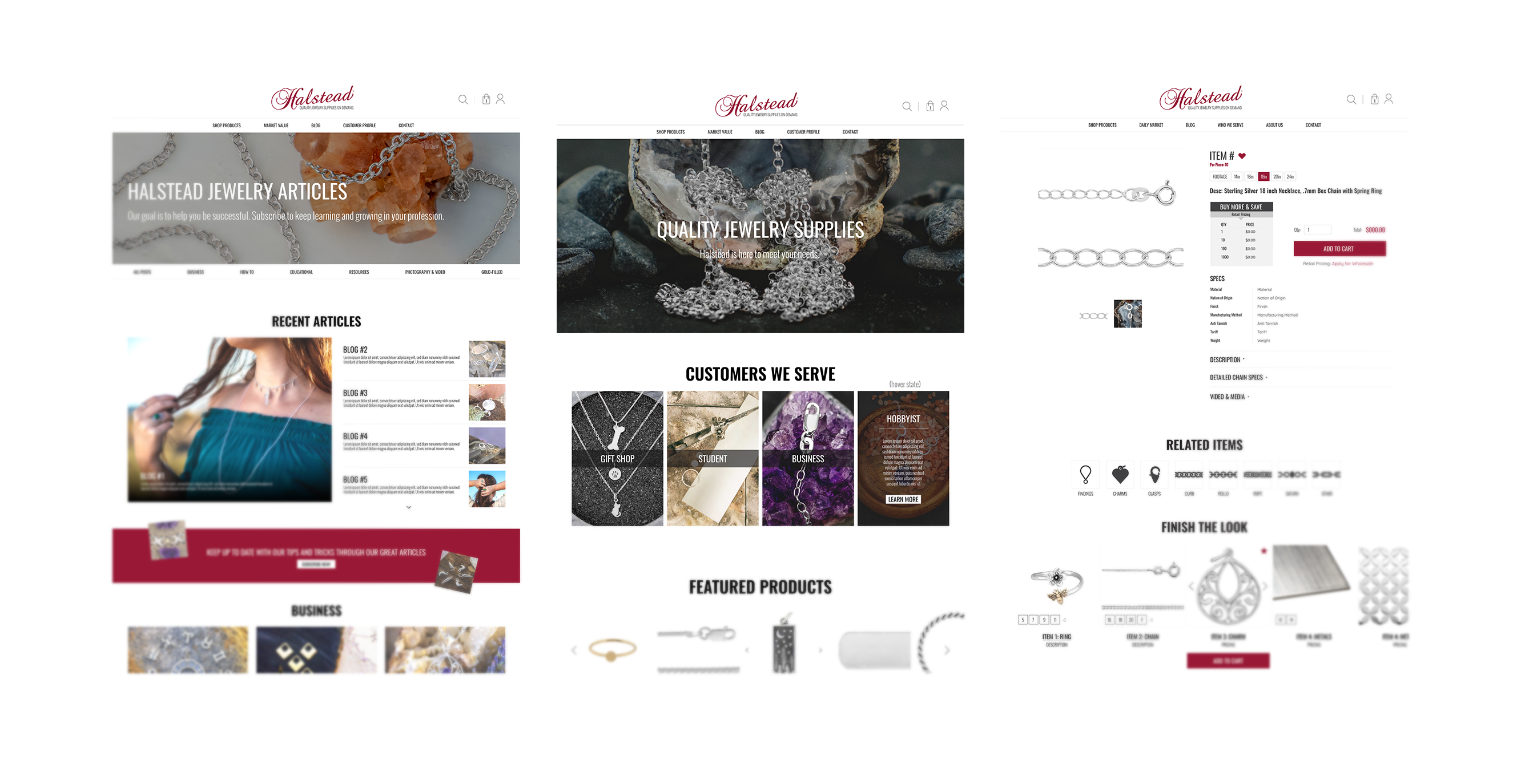
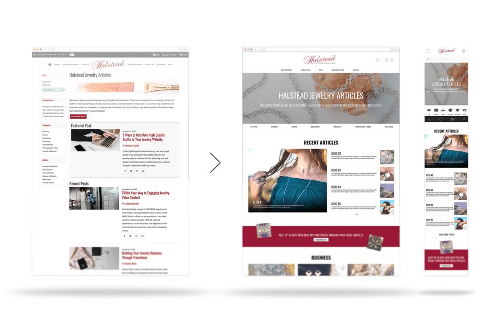
BLOG HOME PAGE
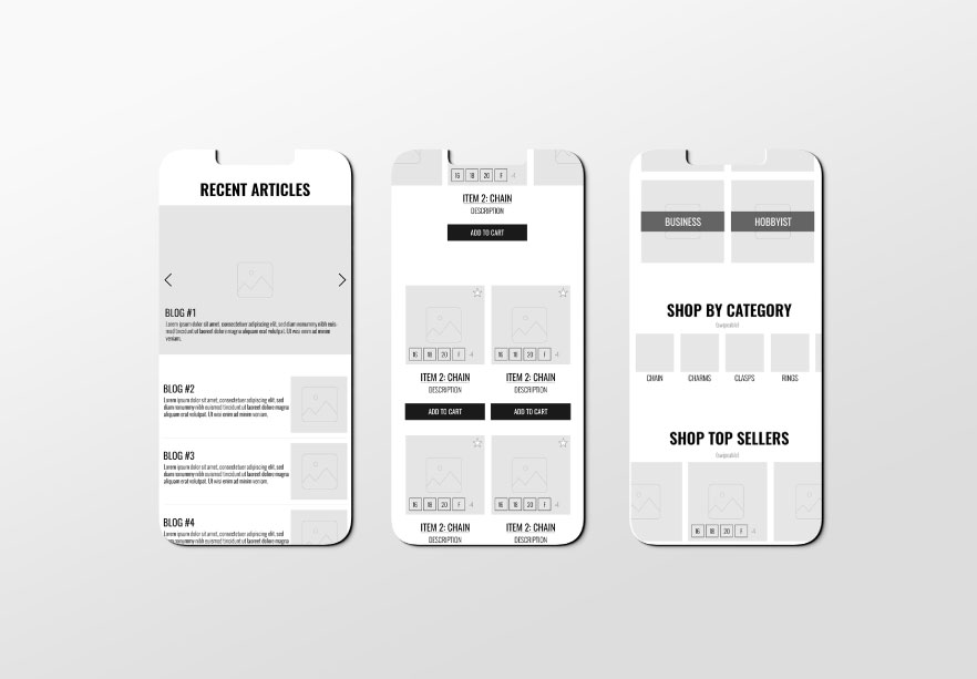
For the new blog design, the marketing team wanted to show customers more recent articles in a smaller space, so I redesigned the first section after the masthead to show several articles in one area.
Another update was creating sections to feature articles from all of the blog categories.
PRODUCT CATEGORY PAGE
The category page design was changed to better match the rest of the website by including a masthead. We also made the subcategory images more evergreen by switching them from compilation images to icons.
To allow customers to focus more on the products, we reduced the amount of information showing on the page by moving the filter menu to be a sticky dropdown option at the top of the screen.
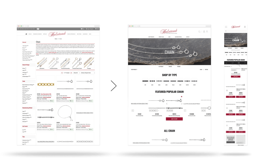
PRODUCT DETAILS PAGE
Like the other pages, I simplified the item detail page. Before, customers would be overwhelmed with the amount of information showing on the screen. Now the item details are shown via an accordion menu.

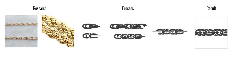
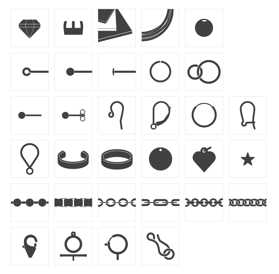
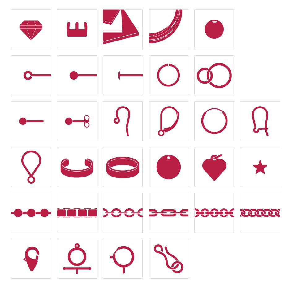
ICON DESIGN
To make the website design more evergreen, I was tasked with designing custom jewelry related icons for the different categories of items we carried.
Each icon was designed from the more easily recognizable item in the category. This way customers would be able to readily identify the category without needing to read the description.
Icon design process
RESULTS
Unfortunately the new designs for the Halstead website weren’t fully realized due to issues with the initial web developer hired for the job. Much of the new website looks similar, but does not match the designs that were presented to them. Thankfully in the end the new Halstead website boasted a simpler, sleeker design.
Thanks to a social media campaign and other efforts, Halstead customers had advanced warning of the need to reset accounts along with examples of the new layout and navigation. Because of this outreach, the initial launch was met with positive feedback from customers.